Everyone that has a website should know some basic web design skills using HTML and CSS. This guide is a crash-course in CSS for complete beginners.
This training won’t overwhelm you with every single, technical detail. I’ve taken the most essential and commonly used techniques to focus your education.
Everything here is explained in a straightforward way that attempts to avoid technical jargon as much as possible, so it’s easy to understand. CSS Code examples are provided along with the designs that they will create.
This CSS training course is part two of the Techie Master Class series. This class assumes you know basic HTML. If you need education in this area, be sure to check out class #1 here: HTML Training Course
ESTIMATED READING TIME: 40 mins
How to Use CSS
There are three different ways that you can use CSS: inline, as a dedicated file loaded with a meta tag (external CSS), and as an HTML tag (internal CSS).
Although any one of the three methods will work, I believe it is important to learn all three in case you need to edit CSS code created by someone else. It can also be handy to know all three for WordPress users – sometimes it is simply more convenient to use one over the others.
Notepad++ Editor
A quick mention about code and the codes image you’ll see in this training course…
I highly recommend a code editor called Notepad++, and it’s completely free.
Any code that will be commonly used on a public website such as PHP, Javascript, HTML, CSS and more can be much easier to edit using this software. It knows commands and functions that you need to use, and it highlights syntax for you. This can be immensely helpful for someone that is a complete beginner to CSS, HTML and other website programming.
Throughout this training course you will notice that syntax in code is highlighted / colorized. This is done by Notepad++.
Inline CSS
With inline CSS, the code is placed inside of the HTML tag that will be altered by the CSS code. This method is the most straightforward, although it also has some drawbacks and limitations.
First, this method tends to create bloated code (more code than what is really needed). This happens because every HTML tag that needs to be altered with CSS needs dedicated inline CSS code to accomplish that. This can result in the same CSS code being repeated many times on a single page, which is the code bloat.
When inline CSS code is overused, you can cause web pages to load slower because of the extra data that needs to be loaded. However, this delay from CSS code bloat is honestly fairly minimal because of the small file size for text compared with other things like images.
As long as you do not find yourself repeating the same CSS code over and over again on the same page, you can use this method without worry.
A major advantage to this method is the ease of use, especially for those just getting started with CSS. The other two methods of using CSS both require additional information in the CSS code to identify the HTML tags that will be altered, while this information isn’t needed with inline CSS because the code alters the tag where it is used.
To use inline CSS code, you simply use the STYLE attribute on an HTML tag. The value of that attribute is the CSS code.
I have provided a brief example of inline CSS code below:

This is a simple HTML link, but it has been styled with CSS to change the font color and to make the text bold. This is how it looks:
Note the STYLE attribute in the HTML code above.
The value of that attribute is the CSS code, which is enclosed in double quotes. The basics of this and other CSS code will be explained in more detail in the next chapter.
Internal CSS
The next method for using CSS is typically used inside of the HEAD tags of a page, but it will still work when used anywhere in your page content as long as it is used before the content you want to alter.
This method (and the meta tag method covered next) offers the most control, but this control also requires some extra work to identify the HTML tags that should be altered with the CSS code.
To use this method, start with an opening and closing STYLE HTML tag. The opening tag needs the attribute TYPE with a value of text/css, although it’s not necessary like it used to be (just a blank style tag is fine).
Anything between the STYLE tags will be CSS code.
The big difference between this CSS code and the CSS code used for inline CSS is that this code needs identifiers or selectors. Identifiers will be discussed in more detail in the CSS basics chapter next.
I have provided a brief example of a CSS STYLE tag below:
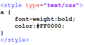
In the example above, I actually used the exact same CSS coding from the inline example. However, you should notice the letter ‘a‘ at the beginning of the line and the opening and closing brackets around the CSS code: { }
The letter ‘a‘ is the selector for that CSS code, which applies to all of the CSS found between the brackets in front of that identifier.
The inline CSS example above changes the attributes of a single link, while this internal CSS example changes the attributes of all links on the entire page.
External CSS
This last method of using CSS is actually considered to be the best to use, simply because it makes for cleaner code by keeping all of the CSS code in a dedicated file that is simply loaded by the page. However, this method also requires the most work and can be the most confusing for beginners to use, especially using WordPress.
This method works exactly like the HTML tag method above with one main exception – the CSS code for this method is in a dedicated CSS file and is loaded by a META tag. This tag should always be in the HEAD tags of a page. If you are using WordPress, your theme may offer you a way to easily add code to the HEAD tags.
I have provided a brief example of a CSS Meta LINK tag below:
In the example above, I have used the LINK HTML tag to load a CSS file. A few attributes are required for this tag to work. The REL attribute should have a value of stylesheet. The TYPE attribute should have a value of text/css. The value of the HREF attribute is set to the website URL for the CSS file you want to load.
Also note the MEDIA attribute with a value of all. This actually controls whether one or more CSS stylesheet is used depending on what kind of device is accessing the page. All is the default value, which simply makes this code work for everything that accesses the site. However, you could create multiple CSS files (one for each type of device) and use different values of MEDIA to declare a specific CSS file for each device. These devices can be used as the value of the MEDIA attribute: all, aural, braille, handheld, projection, print, screen, tty, & tv. All, handheld (mobile/touchpad), print, and screen (computer screens) are the most commonly used of these.
If I was using the example above to load a CSS file that had the same CSS code from the previous two methods, the example below shows the entire content of that CSS file:
As you can see, the CSS file simply contains the code that was between the STYLE tags in the previous method.
In the first method, I mentioned CSS code bloat. Imagine that you had a web page that had 20 links, and you wanted to style them all the same way using CSS. If you used inline CSS code, you would have to repeat that same code in the STYLE attribute of every link. However, by using the Internal or External method, you could simply have one line of CSS code that changed the style of all of the links on the page (like the example code above does).
CSS Basics
Now that you know how to load CSS code into a page, it is time to learn the basics of CSS code so you can create your own.
CSS Syntax
To start, I want to talk about CSS code syntax. Each line of CSS code you write needs to be done in a particular way to avoid errors.
I have reproduced example code below from the inline CSS example in the last chapter:
I am going to explain this CSS code to you here – mainly focusing on the syntax.
The CSS code in this example is found between the double quotes ” “ for the STYLE attribute.
All CSS code can be broken down into basic pieces: a command name, followed by a colon ‘:‘, followed by the value for the command, and ending with a semicolon ‘;‘.
This CSS code actually includes two different commands: font-weight and color.
Notice the ending semicolon after the value for each of those commands. This semicolon separates one command from the next, so it is absolutely essential to use. Technically, the last CSS command in a line of code DOES NOT need a closing semicolon to work, but I highly recommend simply making a habit of putting it at the end of every command value.
For the font-weight command in this example, the value is set to bold – this simply makes the text be displayed bold (like using a B or STRONG HTML tag). Note that the command and value are separated by a colon, and the value is closed with a semicolon.
For the color command, I have set a value of #FF0000. This changes the text color to the value I have set (which is red).
This is a hex color code – try Colorpicker if you need help with generating the hex color code for a specific color.
CSS Selector Identifiers
The next thing that you need to learn about CSS is how to use identifiers / selectors. When you load your CSS code using a method other than the inline method (either HTML or META tag), you will need to use identifiers to get your code to work.
An identifier is added to each line of CSS code so that it knows where to apply that CSS code to the page content, so this is very important.
Using a selector is fairly simple, but understanding how to use them can be a bit more complicated. To use one, simply start your line of CSS code with the identifier, then add a space and an opening curly bracket: {
Your CSS code that goes with that identifier then goes after the opening curly bracket. Finally, put a closing curly bracket at the end of your CSS code for that identifier: }
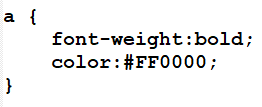
Here is the example I used previously for basic CSS code with an identifier. The selector here is ‘a‘ which will alter the style of all links on the page.
There are three main types of identifiers that you can use with CSS code: tag identifiers, id identifiers and class identifiers. I have discussed each of these in detail below.
Tag Selector
A tag identifier makes reference to a specific type of HTML tag. When you use this type, all of the CSS code that goes with the identifier will affect every instance of that HTML tag throughout your entire page.
The selector that you use in your CSS code should be the same as the name of the HTML tag that you want to alter.
Using the example above, the letter ‘a‘ is the selector, which is for the HTML tag A (links). You could simply replace the A in the example code with the name of another HTML tag like DIV, SPAN, P or many others. You are not limited to using simple HTML tag elements either – you can actually use selectors for HTML tags like HTML or BODY (which covers basically the entire page content).
ID Selector
This type of selector makes reference to the ID attribute value of an HTML tag on your page. The ID attribute value should be unique on any given page, so this particular identifier will only reference one HTML element on your site.
To use this identifier, simply use a number symbol ‘#‘ followed by the value of the ID attribute that you want to target.
Here is some example HTML code for a link that has an ID attribute:
If I wanted to make reference to that link in my CSS code with an identifier, I would use the following code (this code uses the same CSS code that I previously used in the other examples):
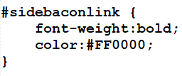
As you can see, this looks almost identical to my previous identifier example except that the identifier has changed. #sidebaconlink is the identifier, which references the HTML tag with the ID attribute set to a value of sidebaconlink.
Class Selector
This type of identifier is very similar to the previous selector, except that it references the CLASS attribute value of an HTML tag. Since a CLASS attribute value can be used many times on a single page, this is an identifier that you can use to reference a specific group of HTML tags that you have created. This could be a single HTML tag but it could also be many of them.
To use this selector, simply use a period ‘.‘ followed by the value of the CLASS attribute that you want to target.
Here is some example HTML code for a link that has a CLASS attribute:
If I wanted to make reference to that link in my CSS code with an identifier, I would use the following code (this code uses the same CSS code that I previously used in the other examples):
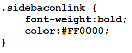
This is almost identical to the ID identifier example, except that this uses a period in front of the identifier name and it makes reference to a CLASS attribute.
Combination Selector
One last selector that I want to mention isn’t really it’s own type but a combination of other types. One of the things that makes CSS so powerful is the flexibility of the identifier system.
You can actually take multiple identifiers and put them together in one line of CSS code.
For example, let’s say that you wanted to have CSS code to alter HTML links (A tag). However, maybe you didn’t want all of the links on the page altered and didn’t want to go through your code to add a class to each tag to use as an identifier. You may actually be able to reference those links in another way using a combination of identifiers. If the links you wanted altered were found within an HTML TABLE tag and it was the only TABLE tag on the whole page, you could use that as a partial identifier.
I have created some example code below that uses a combination of identifiers like this:
As you can see, all I did was put two identifiers in front of the CSS code with a space between the identifiers. This CSS code would then apply to HTML links, but only those located within a table! This same concept can also apply to mixing the identifier types. Using the same example, let’s say I have more than one table on my page and only want this code to apply to links in one of the tables. If that one table has an ID attribute set, I can use that as an identifier instead of the general TABLE tag identifier.
I have created more sample code below for this situation, where my table has an ID value of sidebacontable:
This concept of using multiple identifiers can also be used with more than two identifiers at a time. I also want to show you another example of using multiple identifiers but in a different way. This can help to reduce your workload and also reduce code bloat.
What if you had CSS code that you wanted to apply to two different HTML elements on your page?
This can easily be accomplished by simply separating the selectors with a comma.
For the example below, I have applied the same CSS code to more than one element:
The CSS code above actually alters three different elements: A tags with the ID value of sidebacontable, all div HTML tags, and all td tags found within table tags.
Text: Sizes, Colors & Other Styling
One of the most common things that people want to do with CSS is change the way text is displayed on their site. CSS can be used to easily change text size, colors, fonts, and more.
Text Size
To set the size of text, use the CSS command font-size. The value can be in em, pixels (px) or a percentage (%).
EM vs PX
Personally, I use pixels and will be using them in examples in this tutorial. However, em is technically the recommend size unit because of problems that can be experienced in older versions of Internet Explorer using pixels, plus accessibility and responsiveness. Personally, I just prefer the way pixels are handled in browsers.
Part of this browser handling has to do with accessibility. EM scales better, while PX is better at maintaining size and dimensions. Websites with a heavy focus on mobile responsiveness will usually design with EM. However, I find EM is much more confusing for beginners to try to learn. Start with PX and try out EM when you’re more comfortable with CSS.
The size unit em is a relational size to the current font size. The default text size in browsers is 16px, so 1em is equal to 16px unless you change that default value with CSS.
Simply set a font-size of 100% for the BODY tag and then use the em size unit for other elements. While this works great on sites you design from scratch yourself, WordPress may not be easily customized to work like this unless the theme you are using is already set up this way.
In the long run, the majority of your users will get proper text sizes. Only those using very small or very large text sizes in their browsers will experience sizes that may be a bit larger or smaller than intended, but these users are also likely used to this type of thing with websites. Personally, I will try to change the browser text size myself just to make sure the site text looks OK at any setting. As long as this checks out on mobile phones and desktops, there isn’t much else to worry about.
In general, 16px is considered to be a standard font size, so anything above that will be larger text and anything lower will be smaller text.
In the example below, I have set an inline CSS style to change the font size of this link:
Displays as:
Note the CSS command, font-size, followed by a colon, then the value (18px) and finally the closing semicolon.
Text Weight
The CSS alternative for the HTML tags B or STRONG is the command font-weight. A value of normal is the default value (if this command isn’t used at all), and a value of bold will make the text bold just like those previous HTML tags.
The example below shows the font-weight command in use:

Displays as:
In the example above, I set the link text to be bold with the font-weight command. However, I also added a SPAN tag inside of the link to make the word ‘Plugins’ appear as normal text and not bold.
This command can also accept other values to create varied amounts of bold text. Set the value to a number between 100 and 900, but only use increments of 100. For example, 700 produces bold text while 400 produces normal text, so you can see that there are levels both above bold text and below normal text that you can use as well as levels in between.
Text Colors
To set the color of text, simply use the command color. The value for this command should be a hex color code, which is a number symbol followed by a series of 6 letters/numbers.
To generate a color code, try this site: Colorpicker
The example code below shows this command being used:

Displays as:
In this example, I have used the color command twice. The first one sets the entire link text as the color red (#FF0000). The second one changes just the word ‘Plugins’ to the color blue (#0000FF).
Font Family
The command font-family allows you to change the text font by setting the value of the command to the name of a font family.
There are generic font families and specific font families that you can use, and both are typically used together because of the way this command works. A library of Google Fonts can also be loaded using a website URL, a technique that is popular in WordPress these days.
This command uses a fallback system that allows you to specify more than one font family name. If the first one is not available in a browser, it will attempt to use the next and so on.
Instead of simply giving you a list of individual font names, I wanted to provide you with a more practical solution for font families, so I have put together a list of names that you can use, as-is. Each item in this list includes 2-4 font family names, so you can use the whole line for the value of this command.
Sans-Serif Fonts
- Arial, Helvetica, sans-serif
- ‘Arial Black’, Gadget, sans-serif
- ‘Comic Sans MS’, cursive, sans-serif
- Impact, Charcoal, sans-serif
- Tahoma, Geneva, sans-serif
- ‘Trebuchet MS’, Helvetica, sans-serif
- Verdana, Geneva, sans-serif
Serif Fonts
- Georgia, serif
- ‘Palatino Linotype’, ‘Book Antiqua’, Palatino, serif
- ‘Times New Roman’, Times, serif
Monospace Fonts
- ‘Courier New’, Courier, monospace
- ‘Lucida Console’, Monaco, monospace
I have provided an example of the font-family command below, where I have used one of the lists of font families from above.
First, here is a link with the default font on this website:
Displays as:
And now with a different font family:

Displays as:
Notice how I use single quotes around the font family names that are more than one word long.
Technically, you could also use double quotes here, but you have to be sure that they won’t cause an error because of mismatched quotes. In this example, I have used inline CSS code with my HTML.
The HTML attributes are using double quotes, so it is very important for my CSS to only use single quotes. Otherwise, HTML would interpret the first double quote as the close of the style attribute, which would cut off the real CSS code and cause things to not work as expected.
Font Style
The CSS alternative for the HTML tags I and EM is the command font-style. With a value of normal, this command simply displays standard text, but with a value of italic or oblique it will display italic text. The oblique value provides text that is slanted more than italic text.
I have provided an example below:

Displays as:
In this example, the text in the link is made italic, but the words ‘Plugins’ is made oblique (more slanted italics).
Small Caps Text
Another simple CSS command that I really like to use is font-variant. With the value set to normal, this command just produces standard text, but with the value set to small-caps it will make text all capital letters with the lowercase letters being smaller capital letters.
I have provided an example of the font-variant small-caps command below:
Displays as:
In this example, I have simply set the link text to display with the small-caps font variant.
List Styles
With HTML lists, the default marker for list items can be changed with the CSS command list-style-type.
There are more than 20 different values that can be used for the list-style-type command, so I will just be listing some of the most commonly used along with a brief description of the marker that each value creates:
- circle – A hollow circle.
- decimal – Ascending numbers (default for OL lists)
- decimal-leading-zero – Ascending numbers with a leading zero for numbers under 10
- disc – A filled circle (default for UL lists)
- inherit – These lists will inherit the value from the parent element/list (this value can be used
- with many CSS commands)
- lower-alpha – Lowercase letters
- lower-roman – Lowercase roman numerals
- none – No marker
- square – A filled square
- upper-alpha – Uppercase letters
- upper-roman – Uppercase roman numerals
This CSS command should be used on the UL and/or OL tags that are used to create lists.
Here is an example of an ordered list that is using uppercase roman numerals instead of the default numbering:
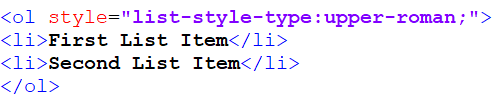
Displays as:
- First List Item
- Second List Item
List Marker Images
Instead of using one of the predefined list image styles, you can also set your own using an image file.
This is done with the list-style command.
To use this command, you will need to have the website address of the image file you want to use as the marker. This goes in the value of the list-style command, along with a url wrapper. You can also provide a default list-style-type to use with this command, in case the URL doesn’t load for any reason.
An example of this command is below:
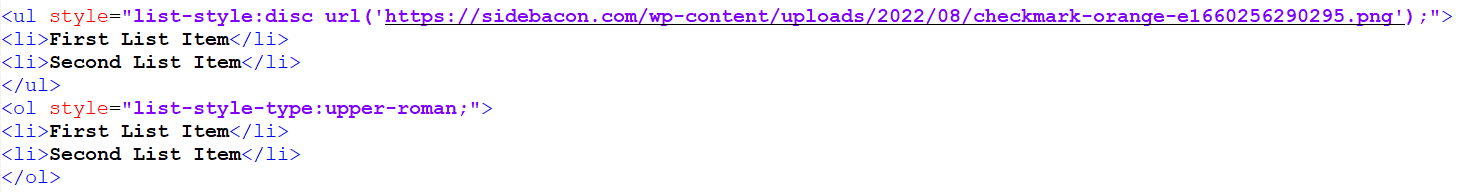
Displays as:
- First List Item
- Second List Item
- First List Item
- Second List Item
Element Layout, Positioning & Sizing
One of the most common things that I find myself using CSS to do on my websites is to control the layout and/or size of various HTML elements on the page. A number of CSS commands are available that allow you to do this, so I will be discussing those with you in this chapter.
Size
In general, if you want to have an HTML element on your page in a specific place, you will need to size your elements properly to get everything to line up how you want.
Two primary CSS commands can be used to accomplish this: height and width. For either command, simply set a value as a number of pixels (px) or a percentage of the parent element.
Without these commands, an HTML element will automatically size itself. Block elements like DIV tags will always take up 100% width unless otherwise specified, but the height of a DIV element is automatically calculated based on the amount of content in it. Inline elements will size the width to the content automatically.
I will commonly use the DIV tag to create the layout of my entire website, so the height and width commands are very important to control the size of these elements so they are not automatically sized for me.
I have provided an example of these two commands below, where I have set both the height and width of a DIV tag to be 250px:
Displays as:
Layout
When you create DIV tags that have specific widths, they will still line up one on top of the other vertically even if there is enough space for them to line up next to each other horizontally. This happens because DIV tags are block elements.
You can change this default behavior with CSS to make DIV tags line up next to each other instead with the command float. When you set the value of this command to left or right, you are forcing the DIV tag to become an inline element. A value of left causes the element to align to the left and right causes the element to align to the right – both of these alignments take place within the available work space and not necessarily within the scope of the entire page.
By using this one command with sized DIV tags, you can cause the tags to line up next to each other (just be sure there is enough horizontal space in the page to accommodate the tags).
I have provided an example of this below:

Displays as:
As you can see, both elements use a float value of left. This causes them to line up directly next to each other without space between them.
As I mentioned before, you simply need enough horizontal space to hold the elements. If there is not enough horizontal space, the elements will simply start on a new line. A cell phone screen with less than 500px of horizontal space wouldn’t display this correctly (or some of the other examples on this page).
I have provided another example below that shows how this works:
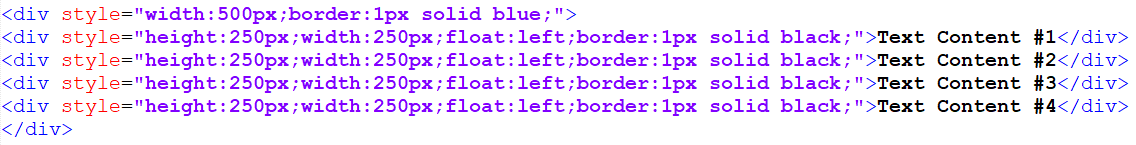
Displays as:
In this example, I have four DIV tags contained within a parent DIV tag. The parent DIV tag is 500 pixels wide, while each of the children are 250 pixels wide and set to float to the left. Since there is only 500 pixels of total width for these DIV tags to float within, there is only room on a single line for two of the DIV tags. As a result, the second two DIV tags would automatically drop to the second line.
This creates a 2×2 grid of DIV tags on the page.
It is very important to remember that anytime you use a float, you must also clear that float once you are done with it! This is done with the clear command. You can use a value of both to clear both floats, or you can use a value of either left or right to just clear one float.
I have provided two different examples below to show you what happens when you don’t clear a float.
Example #1 – Float NOT Cleared:
Displays as:
Page Content
Example #2 – Float Cleared:

Displays as:
Page Content
As you can see from this example, clearing the float prevents anything from showing up on the same line as the floated element(s). Without clearing the float, the next element/text will still show up as an inline element.
Positioning
CSS also provides an easy way to position your elements on the page. This can be especially useful for special situations where you want an HTML element to behave abnormally on your page.
A great example of this is the black WordPress toolbar that is at the top of the page when you are logged into a WordPress site. Ever notice how this toolbar is always at the very top of the page, even when you scroll down the page?
This is accomplished with CSS positioning using three commands: position, left and top.
The position command defaults to the value of static, which makes an element show up as normal. The fixed value positions the element relative to the browser window. The relative value positions the element relative to its normal location on the page. The absolute value positions the element relative to the first non-static positioned parent element on the page.
The commands left and top are used with a value in pixels (px) that represents how much space to offset the element according to the positioning rules that are set for it (because of the position command value).
The easiest way to understand positioning is with an example (no demo since it would look very odd on this page and not make sense until you reached this part):
This element is set to a fixed position with both a left and top value of 0 pixels. This causes the element to get displayed at the top of the page at all times (just like the WordPress admin toolbar I mentioned before). I can’t show how this gets displayed on the live website because it will look really out of place for anyone reading this page until they reach this section, but try it out for yourself with a lot of content on the page that allows it to scroll down.
I have created another example below to go a bit deeper into positioning with CSS:
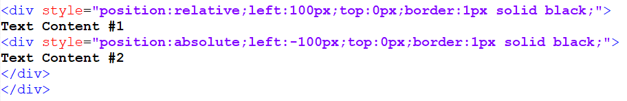
Displays as:
Text Content #1
In this example, I have two DIV tags, both using the position command. The first DIV is using a value of relative. With a left value of 100px and a top value of 0px, this element will be moved 100 pixels to the right in the content relative to its normal position on the page. The second DIV element is using a value of absolute for the position, which causes its position to be relative to the first parent element with a non-static position (the first DIV, in this case). With a left value of -100px and a top value of 0px, this second DIV will show up 100 pixels to the left of the first DIV element.
Padding & Margins
Without CSS coding, elements like DIV tags will not have any padding or margins.
The lack of margins allows the DIV tags to sit directly against other DIV tags. This can be convenient to use when building a site layout, but there are other times when you will want to have margins to provide some space between elements.
The easiest way to understand margins and padding is to think of margins as being the spacing outside of an element and padding as being spacing inside of an element.
To create a margin around the outside of an element, use the margin CSS command. The value should be a number of pixels, which is the amount of space added to the outside of the element on all sides. You can also add margins one at a time with commands like margin-top, margin-bottom, margin-left and margin-right.
Padding works the same way except that it is spacing inside of an element and uses the command padding. If your element has a border, padding will show up as spacing between the border and the content in the element.
I have created an example below to show padding and margins being used. I have used the border command in this example so that the padding and margins can be more easily seen. We’ll chat about borders in more detail in the next chapter.

Displays as:
The first DIV tag has padding and spacing of 5px, while the second has 15px for both. As you can see from the differences between the two, the margin alters where the element is displayed on the page and the padding alters where the content in the element is displayed.
Layering with Z-Index
The z-index command can be used when your page elements are moved on top of each other (using the position command). The z-index command accepts a number as the value, and then elements will be stacked on the page starting with the lowest z-index number and working up to the highest z-index number.
Using this command makes it possible to layer your elements instead of forcing everything to sit next to each other.
I have created an example below that shows how this works:
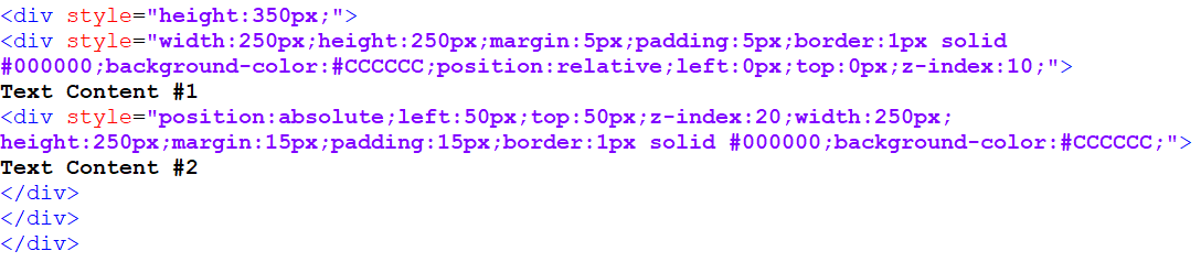
Displays as:
Text Content #1
This example is a total of 3 DIV tags, each one inside of the next.
The first DIV is a placeholder that is stretching enough vertical space to contain the other two DIVs. Without this, you would find that some of the content would be cut off from the bottom of the display (at least when used within the content of a WordPress page).
The second and third DIVs are very similar to those that I created in the previous example, except that I have positioned these so that one lays on top of the other. I also added a background color (which will be explained in more detail in the next chapter) so that the boxes wouldn’t be see-through.
The second DIV is positioned relative and does not have its actual position altered (this is needed for positioning the third DIV). The z-index is set to 10 for this DIV.
With the third DIV, the position is set to absolute, which sets its position with the parent element. I then move the element to right and down 50 pixels (top:50px and left:50px). With a z-index of 20, this element is displayed on top of the parent element.
Backgrounds & Borders
By simply adding background colors or images and borders to elements, you can make them appear as though they could be graphics and not designed with HTML/CSS. Ultimately, this type of thing is what makes CSS so powerful to use because it can save you a ton of time and even help you avoid outsourcing for graphics work.
Element Borders
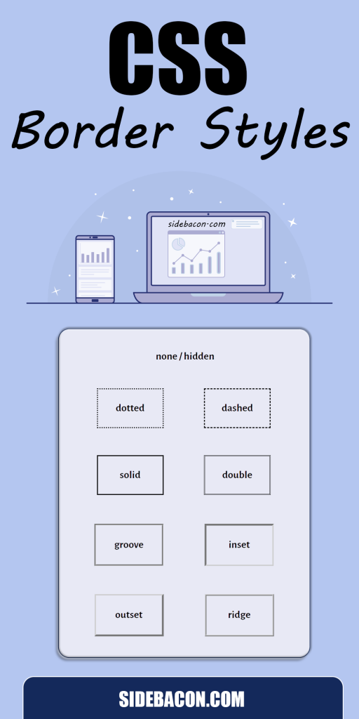
The border command allows you to create a border around an HTML element. The value for this command requires three parts: an amount of pixels for the width of the border, the border style, and the color of the border.
The border style can be any one of a number of possible values that controls how the border looks.
I’ve listed the possible border values below and provided a brief description for each:
- none – No border
- dotted – Dotted line border
- dashed – Dashed line border
- solid – Solid line border
- double – Double line border
- groove – 3D grooved border
- inset – 3D inset border
- outset – 3D outset border
- ridge – 3D ridged border
I have provided an example of a DIV element with a border around it below:

Displays as:
The last CSS command in that example creates the border. As you can see, there are three parts to my value and each is separated by a space. The first part of the value is the width of the border in pixels (1px), the second part is the border style name (solid), and the third part is a hex color code that controls the color of the border (#000000). This creates a 1 pixel wide, black, solid line border around the entire element.
Besides being used for design purposes, I sometimes use borders for another purpose: troubleshooting.
If I am creating a layout with HTML and something isn’t lining up right, using borders can be an easy way to figure out what is going wrong. Just add borders to all of your elements to truly see how everything is lining up. I have done this many times and been able to immediately realize what I did wrong after seeing everything with borders.
If you remember from margin and padding that you can apply those commands to just one side of your element by adding a hyphen and an additional phrase to the end of each command. The border command works the same way, so you can use border-top, border-bottom, border-left, and/or border-right to apply a border to just one side of an element.
Element Backgrounds
Setting a solid background color for an element can be done with the background-color command.
The value should be a hex color code that controls the background color.
The example below uses the previous example with an added background color. The background takes up the height/width of the element and the padding space.

Displays as:
This example fills the DIV element with a light-grey background color (#CCCCCC).
Background Images
A background can also be set as an image file instead of using a solid color. This allows for a nearly endless variety of design options.
By default, a background image will be repeated horizontally and vertically and placed in the top-left corner of an element. You can use the background-image command to show an image this way, but in most cases, this is not how you will want an image to be displayed, so I recommend using the standard background command instead to have more control over the image.
The background command actually takes the values of up to 8 different background commands. You can choose to use as many or few of these as needed and use them in any order: background-color, background-position, background-size, background-repeat, background-origin, background-clip, background-attachment, background-image. If you would like to do more complicated things with background images, just search Google for CSS information on any one of those commands to find out more.
For this tutorial, I want to show you how to use this command to display a background image. I have provided some example code below that shows how this is done:

Displays as:
In this example, my background command has a total of 5 values in this order: background-color (#CCCCCC), background-image (url(‘https://sidebacon.com/wp-content/uploads/2022/08/background-image-css.png’)), background-repeat (no-repeat), background-attachment (scroll), and background-position (center).
The background-color value is used as a fallback in case the image isn’t loaded (a very small percentage of internet users actually have image downloading disabled in their browsers, for example).
The background-image value starts with url, then an opening parenthesis and single quote (‘, then the web address of the image file, and then closes with another single quote and a closing parenthesis ‘).
The background-repeat value is set to no-repeat, which prevents the entire image from being repeated. You could also use repeat as a value to make it repeat both horizontally and vertically. A value of repeat-x makes the image only repeat horizontally, while a value of repeat-y makes it only repeat vertically.
The background-attachment value specifies whether the background scrolls with the rest of the page or not. A value of scroll is the default value, which causes the background image to scroll as normal with the element. A value of fixed causes the background to maintain the same position in the window, even when scrolled (this is how pages are created that have a background image that doesn’t scroll with the rest of the page). A value of local could also be used to make the background scroll with the elements contents, although this value isn’t used too often. Technically, I didn’t need to use this because I am using the default value, but I wanted to use it and explain it so you would know how to use it when needed.
The background-position value sets the starting position of the background image in the element. The value for this should actually be a two-part value, but I have left off a value because I am using center as my value (an omitted value for this defaults to center).
There are a few different types of values that can be used for this two-part background-position value. The first type is a keyword based value: left, right, top, bottom, or center. For example, if I wanted the image to start in the top-right corner of the element, I would use the value of right top. The second type is a numerical value, which can either be in pixels or a percentage (technically, any CSS supported size unit can be used here, like em for example). Any combination of these measuring units can be used, but the first value is for the x position (horizontal) and the second value is for the y position (vertical). For example, the value of 0% 0% or 0px 0px represents the top-left corner of an element and the bottom-right corner is 100% 100%. If one value is left out, it defaults to 50% or center.
CSS Training Course Summary & Next Steps
The knowledge included in this free CSS training course is intended as a basic crash course to teach you some of the most common commands used for website design. However, there is much more you can learn about CSS.
Additional CSS guides will be released on this website in the future. Join our free newsletter through the link below to get notified when we release new articles that are noteworthy like this one. You’ll also get an extensive ebook guide when you join our newsletter that will teach you about 101 different side hustles you can use to make money.
» Download Side Hustle Bible eBook & Join SideBacon Newsletter
This CSS training course is part of our Techie Master Class series. This class assumes you know basic HTML. If you need education in this area, be sure to check out class #1 here: HTML Training Course